Differential gene expression (DGE) analysis overview
Last updated: November 28, 2023
Section Overview
🕰 Time Estimation: 20 minutes
💬 Learning Objectives:
- Describe how to set up an RNA-seq project in R
- Describe RNA-seq data and the differential gene expression analysis workflow
- Load and create a count matrix from our preprocessing analysis using Salmon
- Explain why negative binomial distribution is used to model RNA-seq count data
The goal of RNA-seq is often to perform differential expression testing to determine which genes are expressed at different levels between conditions. These genes can offer biological insight into the processes affected by the condition(s) of interest.
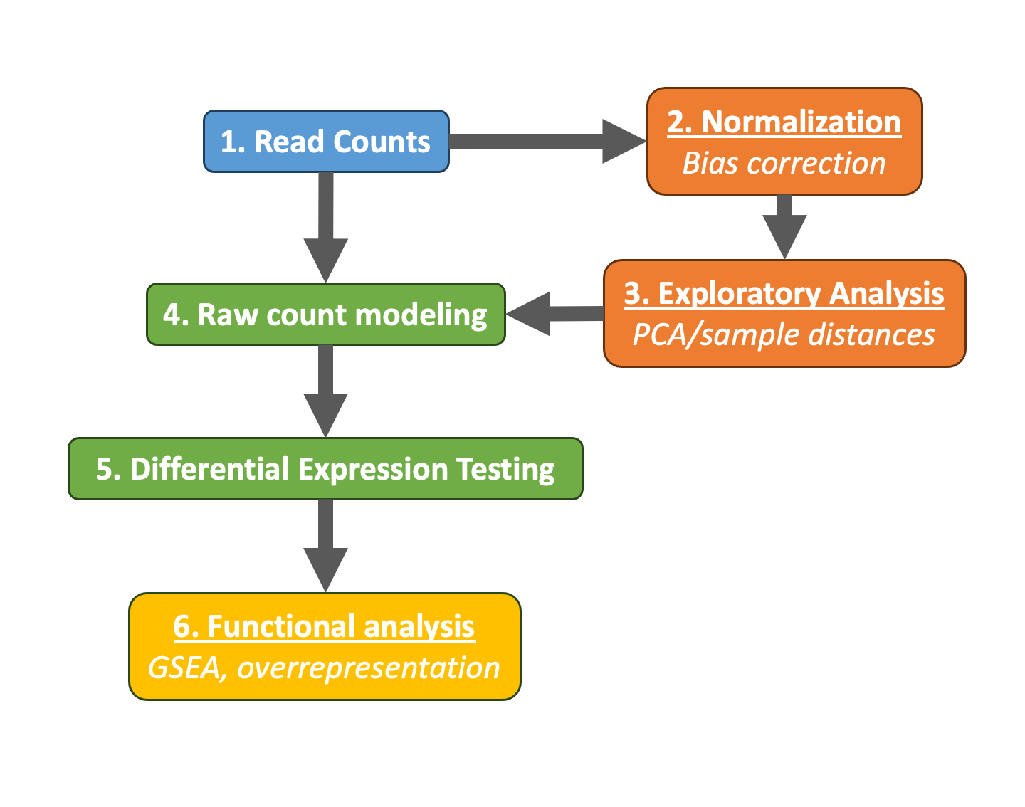
To determine the expression levels of genes, our RNA-seq workflow followed the steps detailed in the image below.
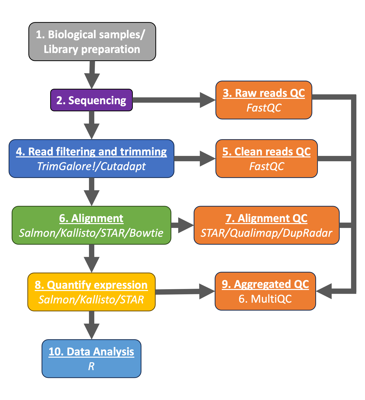
All steps were performed using the nf-core RNAseq pipeline in our previous lesson. The differential expression analysis and any downstream functional analysis are generally performed in R using R packages specifically designed for the complex statistical analyses required to determine whether genes are differentially expressed.
In the next few lessons, we will walk you through an end-to-end gene-level RNA-seq differential expression workflow using various R packages. We will start with the count matrix, do some exploratory data analysis for quality assessment and explore the relationship between samples. Next, we will perform differential expression analysis, and visually explore the results prior to performing downstream functional analysis.
Setting up
Before we get into the details of the analysis, let"s get started by opening up RStudio and setting up a new project for this analysis.
- Go to the
Filemenu and selectNew Project. - In the
New Projectwindow, chooseExisting Directory. Then, chooseIntro_to_bulkRNAseqas your project working directory. - The new project should automatically open in RStudio.
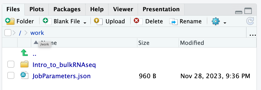
To check whether or not you are in the correct working directory, use getwd(). The path /work/Intro_to_bulkRNAseq should be returned to you in the console. When finished your working directory should now look similar to this:
- Inside the folder
Notebooksyou will find the scripts (inRmdformat) that we will follow during the sessions. - In the folder
Resultsyou will save the results of your scripts, analysis and tests.
To avoid copying the original dataset for each student (very inefficient) a backup of the preprocessing results is inside this folder /work/Intro_to_bulkRNAseq/Data/. You are also very welcome to use your own preprocessing results!
Now you can open the first practical session: 05b_count_matrix.Rmd
Loading libraries
For this analysis we will be using several R packages, some which have been installed from CRAN and others from Bioconductor. To use these packages (and the functions contained within them), we need to load the libraries. Add the following to your script and don"t forget to comment liberally!
library(tidyverse)
library(DESeq2)
library(tximport)

# And with this last line of code, we set our working directory to the folder with this notebook.
# This way, the relative paths will work without issues
setwd(dirname(rstudioapi::getActiveDocumentContext()$path))
The directories of output from the mapping/quantification step of the workflow (Salmon) is the data that we will be using. These transcript abundance estimates, often referred to as "pseudocounts", will be the starting point for our differential gene expression analysis. The main output of Salmon is a quant.sf file, and we have one of these for each individual sample in our dataset.
For the sake of reproducibility, we will be using the backup results from our preprocessing pipeline. You are welcome to use your own results!
# Tabulated separated files can be opened using the read_table() function.
read_table("/work/Intro_to_bulkRNAseq/Data/salmon/control_1/quant.sf", ) %>% head()
For each transcript that was assayed in the reference, we have:
- The transcript identifier
- The transcript length (in bp)
- The effective length (described in detail below)
- TPM (transcripts per million), which is computed using the effective length
- The estimated read count ("pseudocount")
What exactly is the effective length?
The sequence composition of a transcript affects how many reads are sampled from it. While two transcripts might be of identical actual length, depending on the sequence composition we are more likely to generate fragments from one versus the other. The transcript that has a higher likelihood of being sampled, will end up with the larger effective length. The effective length is transcript length which has been "corrected" to include factors due to sequence-specific and GC biases.
We will be using the R Bioconductor package tximport to prepare the quant.sf files for DESeq2. The first thing we need to do is create a variable that contains the paths to each of our quant.sf files. Then we will add names to our quant files which will allow us to easily distinguish between samples in the final output matrix.
We will use the samplesheet.csv file that we use to process our raw reads, since it already contains all the information we need to run our analysis.
# Load metadata
meta <- read_csv("/work/Intro_to_bulkRNAseq/Data/samplesheet.csv")

# View metadata
meta
Using the samples column, we can create all the paths needed:
# Directory where salmon files are. You can change this path to the results of your own analysis
dir <- "/work/Intro_to_bulkRNAseq/Data"

# List all directories containing quant.sf files using the samplename column of metadata
files <- file.path(dir,"salmon", meta$sample, "quant.sf")

# Name the file list with the samplenames
names(files) <- meta$sample
files
Our Salmon files were generated with transcript sequences listed by Ensembl IDs, but tximport needs to know which genes these transcripts came from. We will use annotation table the that was created in our workflow, called tx2gene.txt.
tx2gene <- read_table("/work/Intro_to_bulkRNAseq/Data/salmon/salmon_tx2gene.tsv", col_names = c("transcript_ID","gene_ID","gene_symbol"))
tx2gene %>% head()
tx2gene is a three-column data frame linking transcript ID (column 1) to gene ID (column 2) to gene symbol (column 3). We will take the first two columns as input to tximport. The column names are not relevant, but the column order is (i.e transcript ID must be first).
Now we are ready to run tximport. The tximport() function imports transcript-level estimates from various external software (e.g. Salmon, Kallisto) and summarizes to the gene-level (default) or outputs transcript-level matrices. There are optional arguments to use the abundance estimates as they appear in the quant.sf files or to calculate alternative values.
For our analysis we need non-normalized or "raw" count estimates at the gene-level for performing DESeq2 analysis.
Since the gene-level count matrix is a default (txOut=FALSE) there is only one additional argument for us to modify to specify how to obtain our "raw" count values. The options for countsFromAbundance are as follows:
no(default): This will take the values in TPM (as our scaled values) and NumReads (as our "raw" counts) columns, and collapse it down to the gene-level.scaledTPM: This is taking the TPM scaled up to library size as our "raw" countslengthScaledTPM: This is used to generate the "raw" count table from the TPM (rather than summarizing the NumReads column). "Raw" count values are generated by using the TPM value x featureLength x library size. These represent quantities that are on the same scale as original counts, except no longer correlated with transcript length across samples. We will use this option for DESeq2 downstream analysis.
An additional argument for tximport: When performing your own analysis you may find that the reference transcriptome file you obtain from Ensembl will have version numbers included on your identifiers (i.e ENSG00000265439.2). This will cause a discrepancy with the tx2gene file since the annotation databases don"t usually contain version numbers (i.e ENSG00000265439). To get around this issue you can use the argument ignoreTxVersion = TRUE. The logical value indicates whether to split the tx id on the "." character to remove version information, for easier matching.
txi <- tximport(files, type="salmon", tx2gene=tx2gene, countsFromAbundance = "lengthScaledTPM", ignoreTxVersion = TRUE)
Viewing data
The txi object is a simple list containing matrices of the abundance, counts, length. Another list element "countsFromAbundance" carries through the character argument used in the tximport call. The length matrix contains the average transcript length for each gene which can be used as an offset for gene-level analysis.
We will be using the txi object as is for input into DESeq2, but will save it until the next lesson. For now let"s take a look at the count matrix. You will notice that there are decimal values, so let"s round to the nearest whole number and convert it into a dataframe. We will save it to a variable called data that we can play with.
There are a lot of rows with no gene expression at all.
Let's take them out!
Differential gene expression analysis overview
So, what does this count data actually represent? The count data used for differential expression analysis represents the number of sequence reads that originated from a particular gene. The higher the number of counts, the more reads associated with that gene, and the assumption that there was a higher level of expression of that gene in the sample.
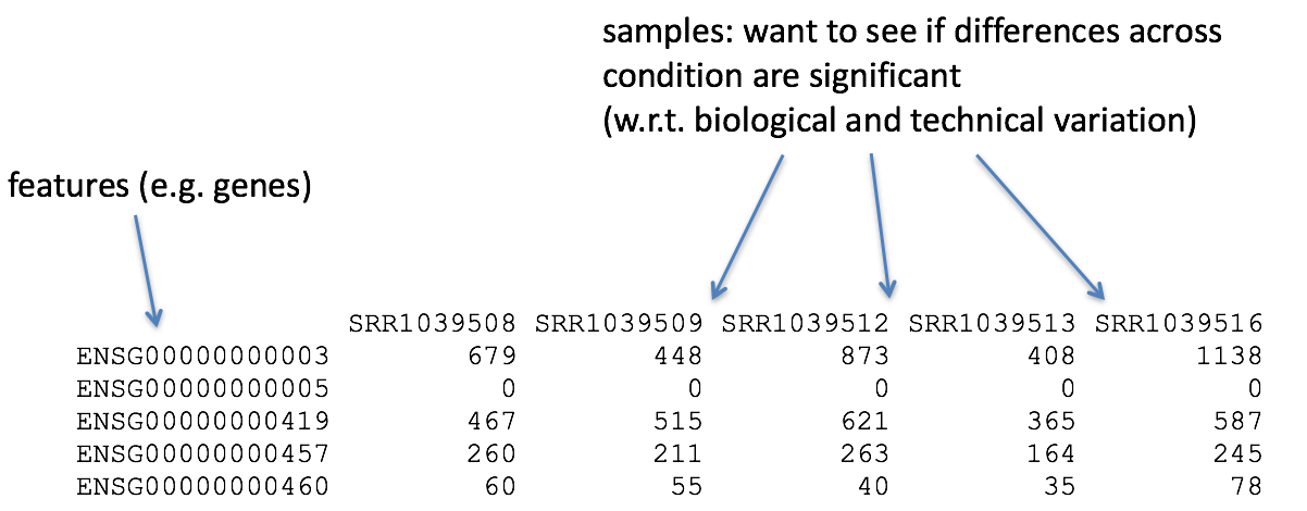
With differential expression analysis, we are looking for genes that change in expression between two or more groups (defined in the metadata) - case vs control - correlation of expression with some variable or clinical outcome
Why does it not work to identify differentially expressed gene by ranking the genes by how different they are between the two groups (based on fold change values)?
Genes that vary in expression level between groups of samples may do so solely as a consequence of the biological variable(s) of interest. However, this difference is often also related to extraneous effects, in fact, sometimes these effects exclusively account for the observed variation. The goal of differential expression analysis to determine the relative role of these effects, hence separating the "interesting" variance from the "uninteresting" variance.

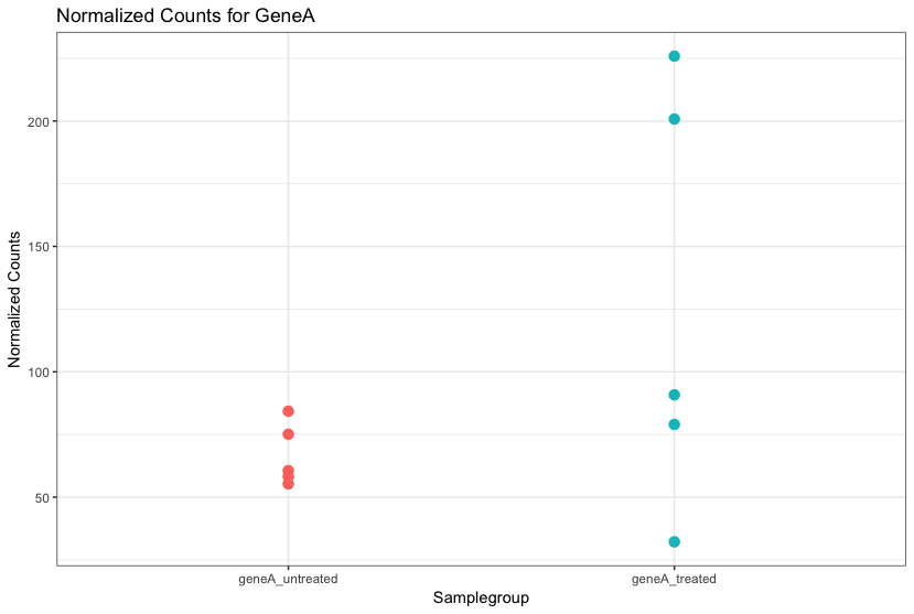
Although the mean expression levels between sample groups may appear to be quite different, it is possible that the difference is not actually significant. This is illustrated for "GeneA" expression between "untreated" and "treated" groups in the figure below. The mean expression level of geneA for the "treated" group is twice as large as for the "untreated" group, but the variation between replicates indicates that this may not be a significant difference. We need to take into account the variation in the data (and where it might be coming from) when determining whether genes are differentially expressed.
Differential expression analysis is used to determine, for each gene, whether the differences in expression (counts) between groups is significant given the amount of variation observed within groups (replicates). To test for significance, we need an appropriate statistical model that accurately performs normalization (to account for differences in sequencing depth, etc.) and variance modeling (to account for few numbers of replicates and large dynamic expression range).
RNA-seq count distribution
To determine the appropriate statistical model, we need information about the distribution of counts. To get an idea about how RNA-seq counts are distributed, let"s plot the counts of all the samples:
# Here we format the data into long format instead of wide format
pdata <- data %>%
  gather(key = Sample, value = Count)

pdata
And we plot our count distribution using all our samples:
ggplot(pdata) +
  geom_density(aes(x = Count, color = Sample)) +
  xlab("Raw expression counts") +
  ylab("Number of genes")
If we zoom in close to zero, we can see a large number of genes with counts close to zero:
ggplot(pdata) +
  geom_density(aes(x = Count, color = Sample)) +
  xlim(-5, 500)  +
  xlab("Raw expression counts") +
  ylab("Number of genes")
These images illustrate some common features of RNA-seq count data, including a low number of counts associated with a large proportion of genes, and a long right tail due to the lack of any upper limit for expression. Unlike microarray data, which has a dynamic range maximum limited due to when the probes max out, there is no limit of maximum expression for RNA-seq data. Due to the differences in these technologies, the statistical models used to fit the data are different between the two methods.
Note on microarray data distribution
The log intensities of the microarray data approximate a normal distribution. However, due to the different properties of the of RNA-seq count data, such as integer counts instead of continuous measurements and non-normally distributed data, the normal distribution does not accurately model RNA-seq counts. More info here.
Modeling count data
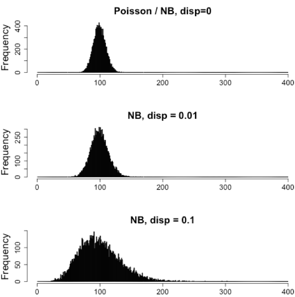
RNAseq count data can be modeled using a Poisson distribution. this particular distribution is fitting for data where the number of cases is very large but the probability of an event occurring is very small. To give you an example, think of the lottery: many people buy lottery tickets (high number of cases), but only very few win (the probability of the event is small).
With RNA-Seq data, a very large number of RNAs are represented and the probability of pulling out a particular transcript is very small. Thus, it would be an appropriate situation to use the Poisson distribution. However, a unique property of this distribution is that the mean == variance. Realistically, with RNA-Seq data there is always some biological variation present across the replicates (within a sample class). Genes with larger average expression levels will tend to have larger observed variances across replicates.
The model that fits best, given this type of variability observed for replicates, is the Negative Binomial (NB) model. Essentially, the NB model is a good approximation for data where the mean \< variance, as is the case with RNA-Seq count data.
Note on technical replicates
- Biological replicates represent multiple samples (i.e. RNA from different mice) representing the same sample class
- Technical replicates represent the same sample (i.e. RNA from the same mouse) but with technical steps replicated
- Usually biological variance is much greater than technical variance, so we do not need to account for technical variance to identify biological differences in expression
- Don't spend money on technical replicates - biological replicates are much more useful
Note on cell lines
If you are using cell lines and are unsure whether or not you have prepared biological or technical replicates, take a look at this link. This is a useful resource in helping you determine how best to set up your in-vitro experiment.
How do I know if my data should be modeled using the Poisson distribution or Negative Binomial distribution?
If it's count data, it should fit the negative binomial, as discussed previously. However, it can be helpful to plot the mean versus the variance of your data. Remember for the Poisson model, mean = variance, but for NB, mean < variance.
Here we calculate the mean and the variance per gene for all columns and genes:
df <- data %>%
rowwise() %>%
summarise(mean_counts = mean(c_across(everything())),
                        variance_counts = var(c_across(everything())))
Run the following code to plot the mean versus variance of each gene for our data:
ggplot(df) +
  geom_point(aes(x=mean_counts, y=variance_counts)) +
  geom_abline(intercept = 0, slope = 1, color="red") +
  scale_y_log10() +
  scale_x_log10()
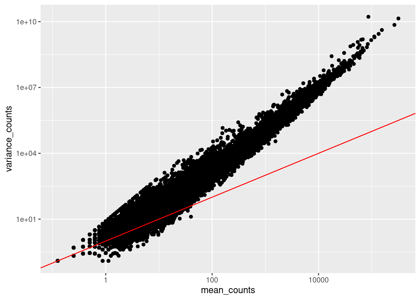
Note that in the above figure, the variance across replicates tends to be greater than the mean (red line), especially for genes with large mean expression levels. This is a good indication that our data do not fit the Poisson distribution and we need to account for this increase in variance using the Negative Binomial model (i.e. Poisson will underestimate variability leading to an increase in false positive DE genes).
Improving mean estimates (i.e. reducing variance) with biological replicates
The variance or scatter tends to reduce as we increase the number of biological replicates (the distribution will approach the Poisson distribution with increasing numbers of replicates), since standard deviations of averages are smaller than standard deviations of individual observations. The value of additional replicates is that as you add more data (replicates), you get increasingly precise estimates of group means, and ultimately greater confidence in the ability to distinguish differences between sample classes (i.e. more DE genes).
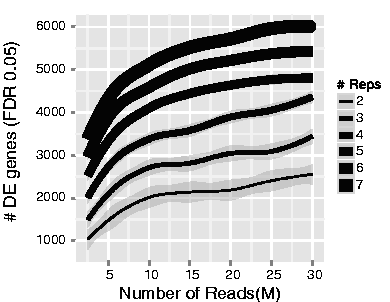
The figure below illustrates the relationship between sequencing depth and number of replicates on the number of differentially expressed genes identified (from Liu et al. (2013)):
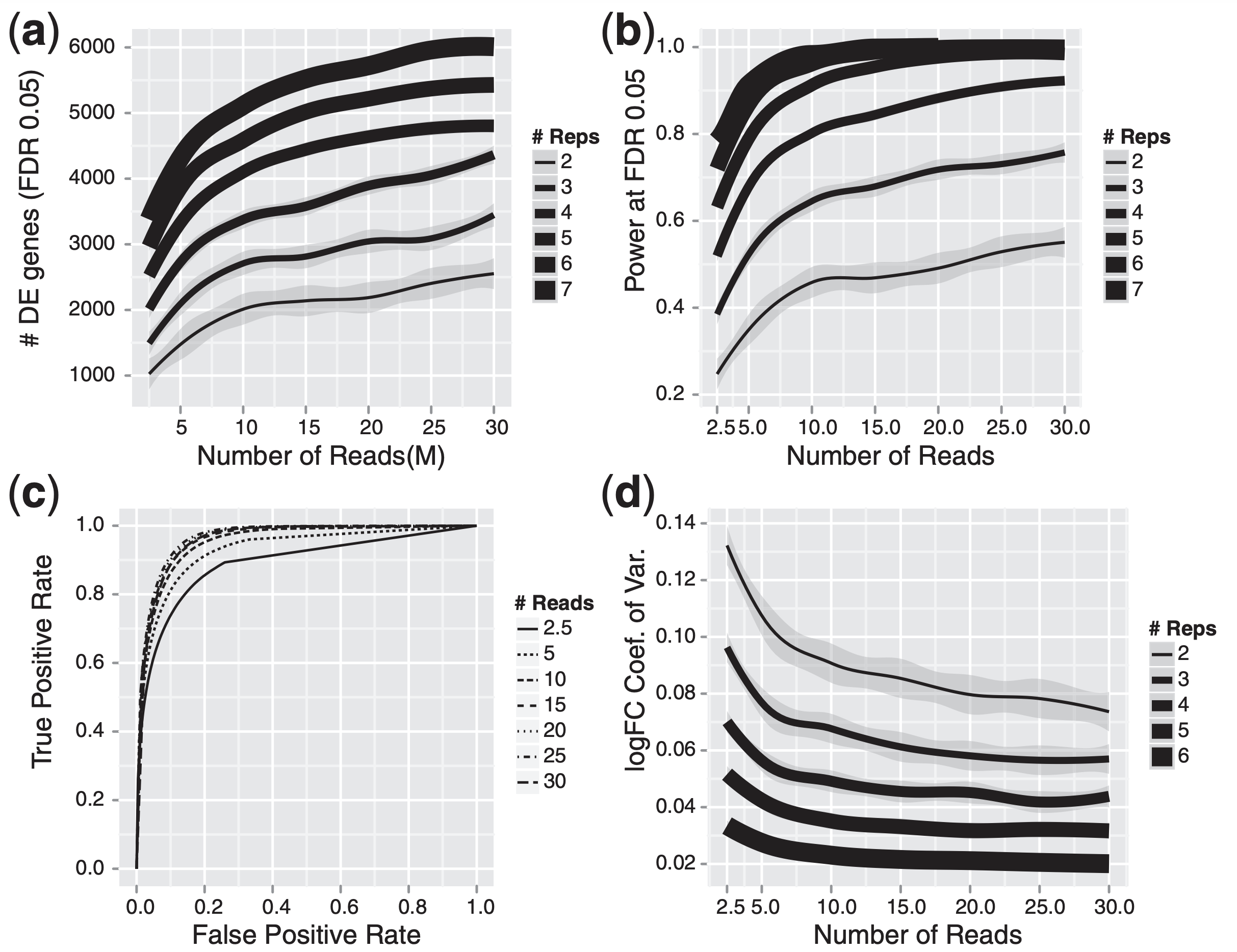
Note that an increase in the number of replicates tends to return more DE genes than increasing the sequencing depth. Therefore, generally more replicates are better than higher sequencing depth, with the caveat that higher depth is required for detection of lowly expressed DE genes and for performing isoform-level differential expression. Generally, the minimum sequencing depth recommended is 20-30 million reads per sample, but we have seen good RNA-seq experiments with 10 million reads if there are a good number of replicates.
Differential expression analysis workflow
To model counts appropriately when performing a differential expression analysis, there are a number of software packages that have been developed for differential expression analysis of RNA-seq data. Even as new methods are continuously being developed a few tools are generally recommended as best practice, like DESeq2, EdgeR and Limma-Voom.
Many studies describing comparisons between these methods show that while there is some agreement, there is also much variability between tools. Additionally, there is no one method that performs optimally under all conditions (Soneson and Dleorenzi, 2013, Corchete et al, 2020).
We will be using DESeq2 for the DE analysis, and the analysis steps with DESeq2 are shown in the flowchart below in green. DESeq2 first normalizes the count data to account for differences in library sizes and RNA composition between samples. Then, we will use the normalized counts to make some plots for QC at the gene and sample level. The final step is to use the appropriate functions from the DESeq2 package to perform the differential expression analysis.
We will go in-depth into each of these steps in the following lessons, but additional details and helpful suggestions regarding DESeq2 can be found in the DESeq2 vignette. As you go through this workflow and questions arise, you can reference the vignette from within RStudio:
vignette("DESeq2")
This is very convenient, as it provides a wealth of information at your fingertips! Be sure to use this as you need during the workshop.
This lesson was originally developed by members of the teaching team (Mary Piper, Meeta Mistry, Radhika Khetani) at the Harvard Chan Bioinformatics Core (HBC).
Created: November 28, 2023