%pip install --quiet scanpy topometry hnswlib pacmap plotly ipywidgets igraph leidenalg scvelo jupyterquiz git+https://github.com/DmitryUlyanov/Multicore-TSNE.gitNote: you may need to restart the kernel to use updated packages.Samuele Soraggi
September 11, 2024
September 16, 2024
Here you will go through some different ways of projecting single cell data. You start with PCA-based projections, then move to geometry-based projections and diagnostic ways of choosing the method which matches best your data. At the end, you will
Here we install some packages, download a file with scripts and the data from the github repository
%pip install --quiet scanpy topometry hnswlib pacmap plotly ipywidgets igraph leidenalg scvelo jupyterquiz git+https://github.com/DmitryUlyanov/Multicore-TSNE.gitNote: you may need to restart the kernel to use updated packages.Load packages
import re
import matplotlib as mpl
import matplotlib.pyplot as plt
import numpy as np
import pacmap
import pandas as pd
import plotly.express as px
import scanpy as sc
import scvelo as scv
import seaborn as sns
import sklearn
import topo as tp
from jupyterquiz import display_quiz
from matplotlib import pyplot as plt
from scipy.cluster import hierarchy as sch
%matplotlib inlineSetup some default figure parameters
Download scripts
Download data from github repository
The dataset is from human testicular tissue, that is divided in round tubules. Each tubule contains spermatogonia cells which are the beginning of the differentiation process, which leads to elongating spermatids (spermatozoa). See figure below.
Other somatic cell types assist the differentiation and movement of cells, and are usually out of the tubules. Below: a section of testis tissue where cells differentiate inside a tubule to become spermatozoa towards the center.
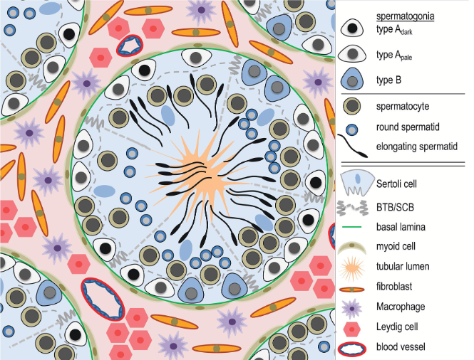
The dataset is a subsample of 10,000 cells from (Winge et al., 2020), already filtered down to 7765 cells. The full data is downloadable and you can find the exact filtering procedure in our summer school tutorial.
We read the data in h5ad format
This is an annotated data (anndata) object. You can look at the object size and content here. We mostly have some cell-related QC measures in obs, and the number of cells expressing each gene in var.
AnnData object with n_obs × n_vars = 7765 × 27897
obs: 'batch', 'super_batch', 'n_genes_by_counts', 'log1p_n_genes_by_counts', 'total_counts', 'log1p_total_counts', 'pct_counts_in_top_50_genes', 'pct_counts_in_top_100_genes', 'pct_counts_in_top_200_genes', 'pct_counts_in_top_500_genes', 'n_counts', 'perc_mito', 'perc_MALAT1', 'n_genes'
var: 'n_cells'Here we proceed with just a rough normalization in the interest of time (transcript per million + logarithm + standardization). In the meanwhile we determine the 5000 most variable genes. A bit more info on normalization here if you want to read. Also consider this paper and the scVerse best practices chapter on normalization.
Now we look at various projections methods.
We start with the usual projection methods everyone starts with after preprocessing, PCA.
PCA is usually the starting point of most calculations in scRNA analysis.
The PCA plot is not able to show much structure in the data, it seems we simply have two long clusters of cells.
sc.pp.pca(adata, random_state=123) # calculate PCA
plt.rcParams["figure.figsize"] = (4, 4)
sc.pl.pca(adata) # plot PCA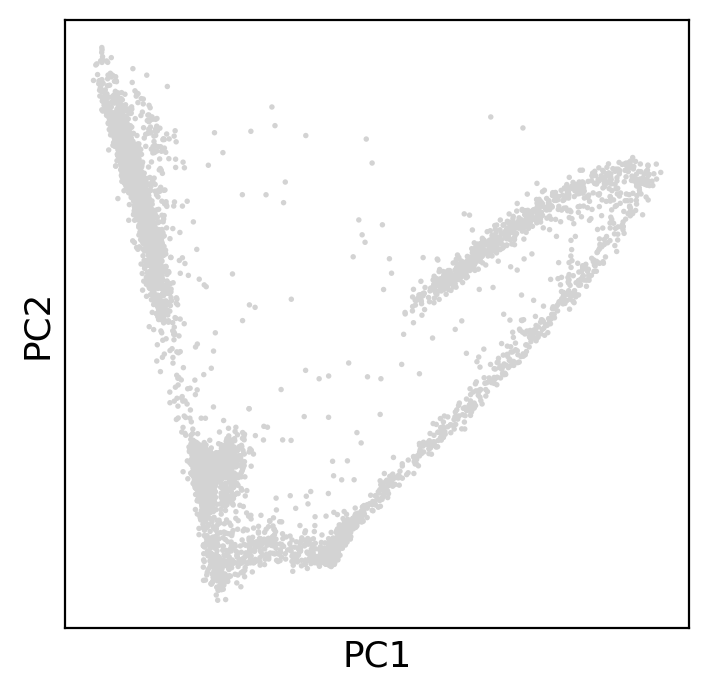
How many components are we able to detect with PCA’s linear separation? It seems 10 principal components contain most of the data’s variance.
Now we want to try out tSNE. tSNE is a graph optimization algorithm, and it is based on optimizing a cost function which balances two strenghts: an attractive one and a repulsive one.
The attractive force draws points closer to each other privileging the global structure (e.g. overall relative position of clusters), while the repulsive force pushes distant points far away, preserving the local structure (e.g. such as cluster separation). More on tSNE in the original paper and in this guidance paper.
Distances are calculated through a gaussian kernel in high-dimensional data, and with t-student in the projection (figure below). A parameter called perplexity determines the width of the gaussian.

We try to plot tSNE with perplexities 1, 10, 100 to see how we can get different tSNEs.
First of all, we calculate distances on the 10 PCA components - which means tSNE will be based on PCA distances (so a non-linear projection is using a linear projection to start with).
Now we run tSNE three times and plot it. We use only 1000 cells because it runs otherwise slow.
plt.rcParams["figure.figsize"] = (10, 4)
fig, axs = plt.subplots(1, 3)
perps = [1, 10, 100]
for i in range(3):
f = sc.pl.scatter(
adata_subset,
basis=f"tsne_P{perps[i]}_",
ax=axs[i],
show=False,
title=f"perplexity {perps[i]}",
)
fig.show()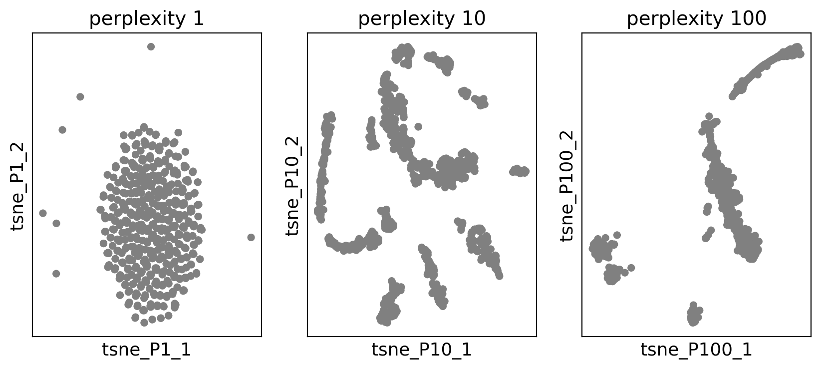
UMAP is also a graph optimization algorithm like tSNE. It also ends up balancing attractive and repulsive forces like the tSNE algorithm. Those two forces change their weight using parameters a and b.
Choose below the a and b parameters and test which plot you get. Try as many times as you want before continuing. Usually, values of a and b are not much distant from 1 and chosen automatically by UMAP, but it is worth tuning them to see the effect. Here the range is restricted to [0.1-2]
# @title #### DIY: UMAP parameters choice {display-mode: "form"}
a = 1 # @param {type:"slider", min:0.1, max:2, step:0.05}
b = 1 # @param {type:"slider", min:0.1, max:2, step:0.05}
print(f"Chosen parameters {a} and {b}")
print("running UMAP...")
sc.tl.umap(adata, a=a, b=b, random_state=123)
print("Plotting")
plt.rcParams["figure.figsize"] = (4, 4)
fig, axs = plt.subplots(1)
sc.pl.umap(adata, ax=axs, show=True)Chosen parameters 1 and 1
running UMAP...
Plotting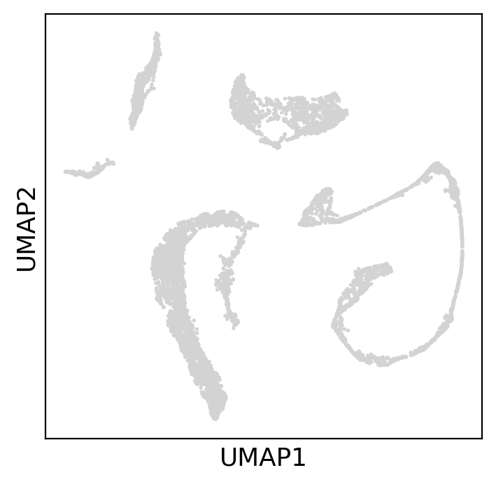
topoMetry works by modelling the geometry of the shape formed by the data points in high dimension. This is done through the so-called discrete Laplace-Beltrami Operator (LBO). For reference, there is a paper and a documentation page for the package.
In few words, the LBO finds a sort of principal components (called eigenfunctions or eigenvectors) of the geometrical shape formed by the data, which pieced together approximate the original dataset (figure below, right).
Usually the eigenvectors are less than the dimension of the data, because many of the genes are related by similar expression patterns (figure below, left). The number of eigenvector is the intrinsic dimensionality of the data, which tells you how many dimensions you need to describe the geometry of the data surface.

The LBO is used in the same way as the PCA, which is, its eigenvector matrix is the starting point for other dimensionality reductions. Now, anything you used will be based on geometry and not on PCA distances.
Below we go through the steps of using such a tool. Remember: no distance preservation is involved in calculating the LBO, it is all about the geometry (curvature and tangent space in each point).
First of all, we subset the data to the highly variable genes.
Then, we calculate the intrinsic dimensionality of the data. This is done with two indices (FSA, MLE) tested on different neighborhoods of each cell. Those two indices estimate the same thing, which is, the intrinsic dimensionality of each cell and its neighbors.
The result is a histogram for which the guideline is to choose the peak. However, tails are also important and can give extra dynamics in the data, so I usually select the number of dimensions on the right side of the peak (before the tail flattens out).
FSA and MLE usually are quite concordant. I usually select the highest estimation of intrinsic dimensionality. Here, for example I choose 250 dimensions.
Now it is time to calculate the Laplace-Beltrami Operator. This is done in a computer by creating a matrix, where each column is an eigenvector of the operator. Every eigenvector describes a geometrical characteristics of the data surface. Topometry gives choice of methods to calculate LBO with projections and clusters based on that. You can choose
kernels how to calculate similaritieseigenmap_method how to calculate LBOprojections which dimensionality reduction to do starting from LBOresolution the LBO-based clustering resolutionDo not worry about the first two (find more in the topometry docs). For the third one we choose diffusion maps (MAP) and PaCMAP (which is superior to UMAP in various ways). For the clustering resolution we choose 0.5.
# Run TopOMetry
# Create a TopOGraph object with the desired parameters
tg = tp.TopOGraph(n_eigs=250, n_jobs=-1, verbosity=1, random_state=42)
# Fit some models to the data
adata = tp.sc.topological_workflow(
adata,
tg,
kernels=["bw_adaptive"],
eigenmap_methods=["LE"],
projections=["MAP", "PaCMAP"],
resolution=0.5,
)Computing neighborhood graph...
Base kNN graph computed in 6.281542 (sec)
Fitted the bw_adaptive kernel in 0.308347 (sec)
Computing eigenbasis...
Fitted eigenbasis with Laplacian Eigenmaps from the bw_adaptive in 8.976884 (sec)
Building topological graph from eigenbasis...
Computing neighborhood graph...
Computed in 0.216704 (sec)
Fitted the bw_adaptive graph kernel in 0.311466 (sec)
Computed MAP in 10.575032 (sec)
Computed PaCMAP in 47.988012 (sec)The resulting projections are inside adata.obsm and have long names which combine the three parameters chosen before to run topoMetry.
Note also we have a clustering in adata.obs.w_adaptive from LE with bw_adaptive_leiden ! This is a clustering based on the LBO instead of the PCA, and calculated together with the projections.
The eigenvector matrix is also there and called X_LE with bw_adaptive
AxisArrays with keys: X_pca, X_umap, X_LE with bw_adaptive, X_MAP of bw_adaptive from LE with bw_adaptive, X_PaCMAP of LE with bw_adaptiveWe rename some of the objects to make them more practically usable
adata.obsm["X_topoMAP"] = adata.obsm["X_MAP of bw_adaptive from LE with bw_adaptive"]
adata.obsm["X_topoPaCMAP"] = adata.obsm["X_PaCMAP of LE with bw_adaptive"]
adata.obs["topo_leiden"] = adata.obs["bw_adaptive from LE with bw_adaptive_leiden"]
adata.obsm["X_eigenvectors"] = adata.obsm["X_LE with bw_adaptive"]Now, let’s look at the clusters on the LBO-based PaCMAP projection and clustering
plt.rcParams["figure.figsize"] = (4, 4)
sc.pl.embedding(
adata,
basis="topoPaCMAP",
color=["topo_leiden"],
palette="tab20",
ncols=2,
legend_loc="on data",
legend_fontsize=10,
)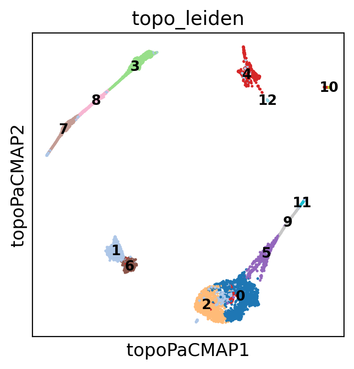
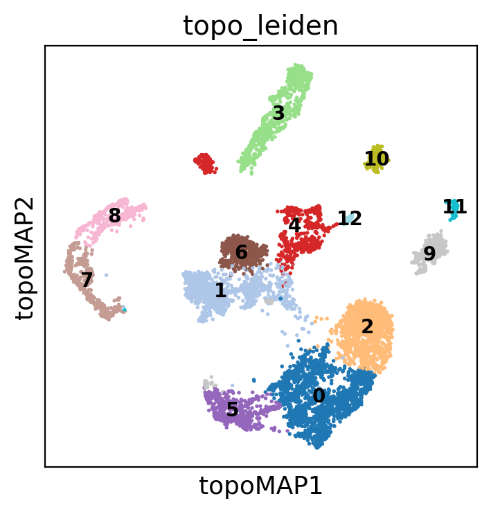
Note how the diffusion maps below lose part of the structure creating a sparse blob of clusters
sc.pl.embedding(
adata,
basis="topoMAP",
color=["topo_leiden"],
palette="tab20",
ncols=2,
legend_loc="on data",
legend_fontsize=10,
)
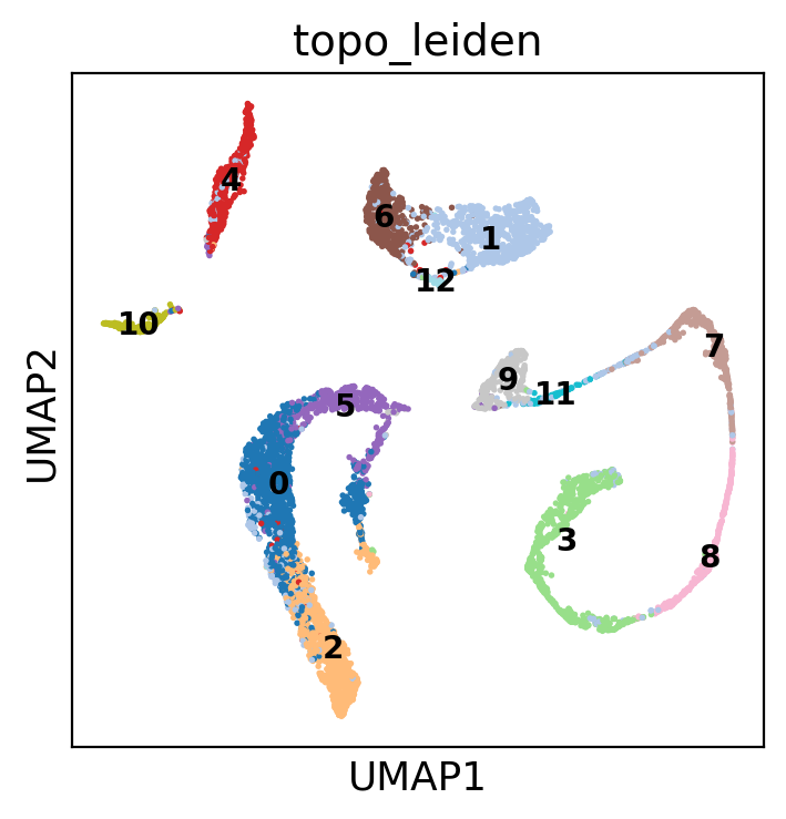
This is instead the UMAP based on PCA, which is maybe the most similar to LBO + PaCMAP
sc.pl.embedding(
adata,
basis="umap",
color=["topo_leiden"],
palette="tab20",
ncols=2,
legend_loc="on data",
legend_fontsize=10,
)
Here I create a list of cell types and their markers, which I then assign using markers scores calculated as in Seurat using one of the scripts we downloaded
markers = dict() # make an empty dictionary
### SPERMATOCYTOGENESIS
markers["SpermatogoniaA"] = ["ID4", "HMGA1"]
markers["SpermatogoniaB"] = ["MKI67", "DMRT1", "STRA8"]
markers["SpermatocytesI"] = ["MEIOB", "PRSS50", "SYCP1", "TEX101"]
markers["SpermatocytesII"] = ["PIWIL1", "ACRV1", "SPATA16", "CLGN"]
### SPERMIOGENESIS
markers["Round.Spt"] = ["SPATA9", "SPAM1"] # Round spermatids
markers["Elong.Spt"] = ["PRM1", "PRM2"] # Elongated spermatids
### SOMATIC CELLS
markers["Sertoli"] = ["CTSL", "VIM", "GATA4"]
markers["Macroph"] = ["CD163", "TYROBP"]
markers["Leydig"] = ["CFD"]
markers["Endothelial"] = ["CD34"]
markers["Myoid"] = ["ACTA2"]
markers["Smooth_Muscle"] = ["RGS5"]We can look at the clustering. See how the cell types enclosed in a tubule are often close together, while other cell types are in separated clusters
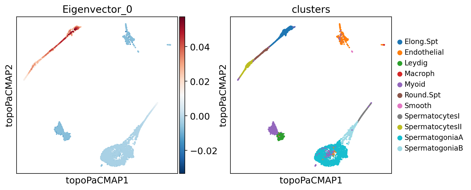
Now, what about looking at the eigenvectors of the LBO, and see what tey highlight in our data?
Below, notice that the eigenvectors matrix has 250 columns, where each is an eigenvector. Eigenvectors are already normalized.
Below there is a question that you can solve by exploring some eigenvectors with the input box after the question:
# @title #### DIY: Choose an LBO eigenvector {display-mode: "form"}
component = 0 # @param {type:"number", min:0, max:250, step:1}
adata.obs[f"Eigenvector_{component}"] = adata.obsm["X_eigenvectors"][:, component]
plt.rcParams["figure.figsize"] = (4, 4)
sc.pl.embedding(
adata,
basis="topoPaCMAP",
color=[f"Eigenvector_{component}", "clusters"],
palette="tab20",
ncols=3,
legend_fontsize=10,
)
plt.rcParams["figure.figsize"] = (12, 4)
print(f"Scores of component {component} by cluster")
f = sc.pl.violin(
adata,
keys=[f"Eigenvector_{component}"],
groupby="clusters",
palette="tab20",
rotation=90,
)
Scores of component 0 by cluster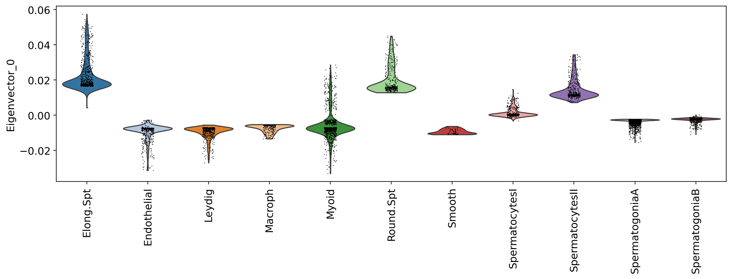
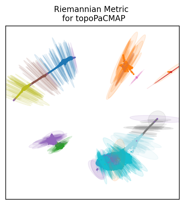
How to choose a projection based on LBO? We can look at the distortion of each projection. As when drawing a map of the globe, projecting single cell data will create distortions. Those can be determined with the riemannian metric.
Topometry uses the metric to draw ellipses around some of the points to show distortions. The directions in which the ellipses are wider are the directions of distortion, and the size of the ellipses’ axae represent the distortion intensity.
Below we plot distortion ellipses on 500 points for all the projections we based on LBO.
# Get the graph Laplacian of our base graph kernel:
L = tg.base_kernel.L
# Define how many ellipses to plot:
n_plot = 500
# Convert the labels to integers:
labels = adata.obs["clusters"].cat.codes
# Name the projections you want to plot:
projections = ["topoMAP", "topoPaCMAP"]
# Plot the Riemann metric
for name in projections:
xy_coord = adata.obsm["X_" + name][:, :2]
tp.pl.plot_riemann_metric(
xy_coord, # The coordinates of the projection
L, # The graph Laplacian
std=0.5, # A scaling factor for the ellipses size
n_plot=n_plot, # How many ellipses to plot
labels=labels,
title=f"Riemannian Metric \n for {name}",
cmap="tab20", # For coloring
random_state=tg.random_state, # For coloring with same colors as before
figsize=(4, 4), # Size of the figure (NEEDS TO BE SQUARE!!!),
)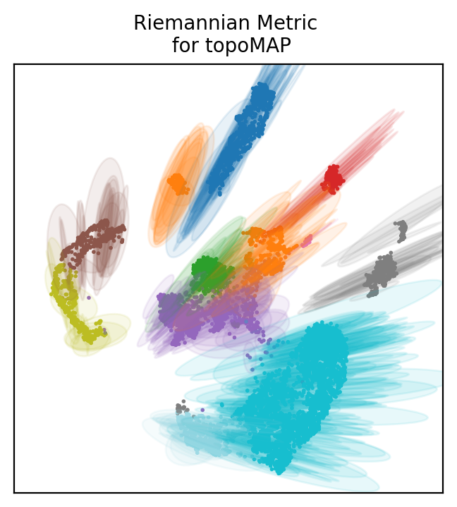
Look at the first plot with diffusion maps. Ellipses are pretty large and many of them have both axae that are wide, meaning distortions in both directions of the 2D space.
Usually, cells at the edge of the plot have some distortion pointing towards the center. This is phisyological and means that distances are not as large as they appear in the 2D space (similarly to distances which are wrong at the edges of the planar world map).
If all cells including those at the center of the plot have large distortions, then the projection is not reliable, because all points coordinates are distorted.
The diffusion map does not seem a very good projection of the data. PaCMap is definitely more reliable, showing mostly only distortion towards the center from the edges.
So this is the end of the workshop. What are the most important points to get out of this?
You might want to document your notebook on your own webpage, and why not, show some interactive plots. Here you can do it easily with a library called plotly express.
For example you can plot your PaCMAP with clusters and with a specific gene expression when you hover the mouse.
px.scatter(x=adata.obsm['X_topoPaCMAP'][:,0],
y=adata.obsm['X_topoPaCMAP'][:,1],
color=adata.obs.clusters,
hover_name=pd.Series(adata[:,"PRM1"].X[:,0] ),
title="Clusters on PacMAP and PRM1 expression on hovering",
height=800)You can also use bubble sizes to look at positive numbers, such as the eccentricity of the ellipses we visualized before.Higher eccentricity means higher distortion in axae directions. You can add an animation slider, here for example on different batches.
fig = px.scatter(
x=adata.obsm["X_topoMAP"][:, 0],
y=adata.obsm["X_topoMAP"][:, 1],
size=adata.obs.topoMAP_eccentricities,
size_max=10,
color=adata.obs.clusters,
animation_frame=adata.obs.batch,
title="Diffusion Maps colored by cluster, sized by eccentricities with selector for batches",
height=800,
)
fig.show()The same plot for PaCMAP shows smaller eccentricities as you would expect.
fig = px.scatter(
x=adata.obsm["X_topoPaCMAP"][:, 0],
y=adata.obsm["X_topoPaCMAP"][:, 1],
size=adata.obs.topoPaCMAP_eccentricities,
size_max=10,
color=adata.obs.clusters,
animation_frame=adata.obs.batch,
title="PaCMAP colored by cluster, sized by eccentricities\nwith selector for batches",
height=800,
)
fig.show()Ok now you are really done. You can see all the plots above in the web version of this tutorial! But note, those plots will not be shown if you created the notebook with google colab, you need to create the plots in jupyterlab to make the plots work (Google Colab has its own renderer for those plots, and it does not work with any other tool for creating webpages…)